

A new day
A lot's gone on with the Microsoft cloud since I first published the Periodic Table of Office 365 in 2017. Back then, I was aiming to help explain what the common apps in the ecosystem do for consulting customers. There were various infographics—especially wheels—covering the apps, but nothing really grouped items by related feature sets.
Various updates have been made over the years in an effort to keep up with new apps, retired apps, and expanding to covering Microsoft 365 Groups. But it hasn't always kept up. Real life gets in the way and falling behind on one small change after one small change after a large change leaves the table not entirely reliable. Even so, this year it's still received 25,000+ page views and counting and I continue to get pinged on Twitter and LinkedIn when people use the graphic in conference sessions across the world.
But, now's the time to catch up. The last update I made to the table was to add Power Virtual Agents. That was a while ago. Since then, Power Platform continues to expand, Microsoft Viva exists, and this year Microsoft decided to go all in on graphic and video creation.
The design process actually starts with paper. It's a lot easier to have movable boxes on a table that I can rearrange as necessary and take photos as I like a layout. Then I'm able to translate that into the web app. Even the photo below didn't end up being the final design, as you can tell if you compare the two.

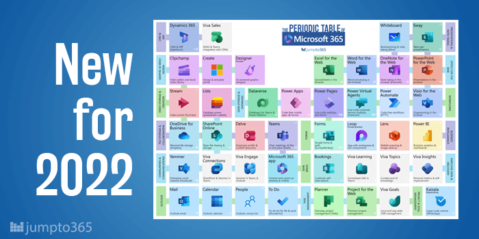
The new table
A number of key changes have taken place with the table and I'm the first to admit that the table is more complex than it was. Unfortunately, that's due solely to the increasing complexity of Microsoft 365. The table today, as always, has simply been a graphical representation of a cloud solution. It doesn't force complexity on the ecosystem—at least that's not the aim. So let's summarize what's changed.
Periodic Table of Microsoft 365
I held back for a while on renaming the table from Office 365 to Microsoft 365. Microsoft's inability to retire the most used enterprise license types, which remained branded as Office 365 even after the introduction of the Microsoft 365 branding. And while that confusion remains, Ignite 2022 did a good job of pushing the branding further, including the update of the Office 365 app to the Microsoft 365 app, and the Microsoft 365 brand receiving a designated icon. So the table is now officially the Periodic Table of Microsoft 365.

A cooler color scheme
My aim had always been to use the colored tiles with white, knock-out versions of app icons. I was successful for a while, but that's not super possible anymore. First, the original design came from the original app launcher design, which included the primary brand color of an app with a white, knock-out app icon. It was basically a copy+paste on my part. The waffle has since changed to a white space with full-color app icons and black titles. It's harder to find knock-out versions of icons and even harder to figure out the primary brand color of individual apps now that most app icons include gradients under the Fluent design scheme (which I love, for what it's worth). So now the tiles contain the full-color app icon on a tile that uses my preferred, but related, color, following a pastel-ish palette.

New groupings
Many of the original groups that I used in the table are no longer relevant or are less relevant than new groupings I've introduced. You'll find more groups and even some cases where a grouping line is shared by two groups, so be sure to check the colors closely. Though, as in the past, you can hover your mouse over any group to see which apps are part of that group. These groups are my opinion, nothing official, and don't represent anything Microsoft says about its ecosystem.


Obviously you have an opinion, so share it!