

Since publishing the Periodic Table of Office 365 originally, I’ve gotten a lot of likes, shares, comments, etc. and I’m really glad that the time and effort it took to put this together is helping others, not just in the Office 365 admin field, but, more importantly, the many more Office 365 users out there. That includes both the original static image design and the later-launched web app; both took a lot of time and effort on the side from regular day jobs to provide this resource to the community. This post was originally published on LinkedIn back in 2017; I thought I'd update it and republish it on this blog.
It's been massively popular worldwide, leading to more than a dozen translations and over a million combined page views in 2019 alone. I've seen it presented at numerous Office 365 conferences (most not by me), and it's even been knocked off a couple times (imitation, flattery, as they say). And since its inception, it's gone from a static image file to an interactive web app thanks to the genius skills of my friend and colleague Niels Gregers Johansen. I was even asked to talk about its origins on Hyperfish's podcast with Jeremy Thake. Have a gander if you've got some time.
Perhaps not surprisingly, I get a lot of direct messages on multiple platforms asking me how I made it. Some asked about the creative source, while others wanted to know specifics like software. These are good questions and answers could help spark similar products to be made that can further help us all out.
So I thought I’d cover the design process. This post doesn't cover the technology behind the web app, just the overall design of the layout and its predecessor concepts. It’s not secret and, frankly, the idea isn’t that novel. And if it can help someone else come up with similar tools that all of us can use, I think that’s a major win for our community.
What's the need?
Go into any meeting at any organization that happens to use Office 365 and ask them all to answer one question: What is Office 365? Now go to an Office 365 user group, SharePoint Saturday, conference, whatever. Ask the same question.
Without fail, you will get a different answer from almost everyone there. Trust me. I do it with users. I do it at conferences. And that is a problem.
From a user’s perspective, O365 is simply a collection of apps. It’s essentially the successor to Windows, but in your browser. The start menu is now the waffle. The apps are now lite versions available in the browser or on mobile.
But humans are visual learners. You can’t just tell them that. You have to show them. So there needs to be a way to display that graphically when starting the topic. In the mid 2010s, a few really good first starts came out. You may have seen “the Office 365 Wheel” and a few other incarnations of “this is Office 365” and “what to use when” visual aids. Kudos to those content creators.
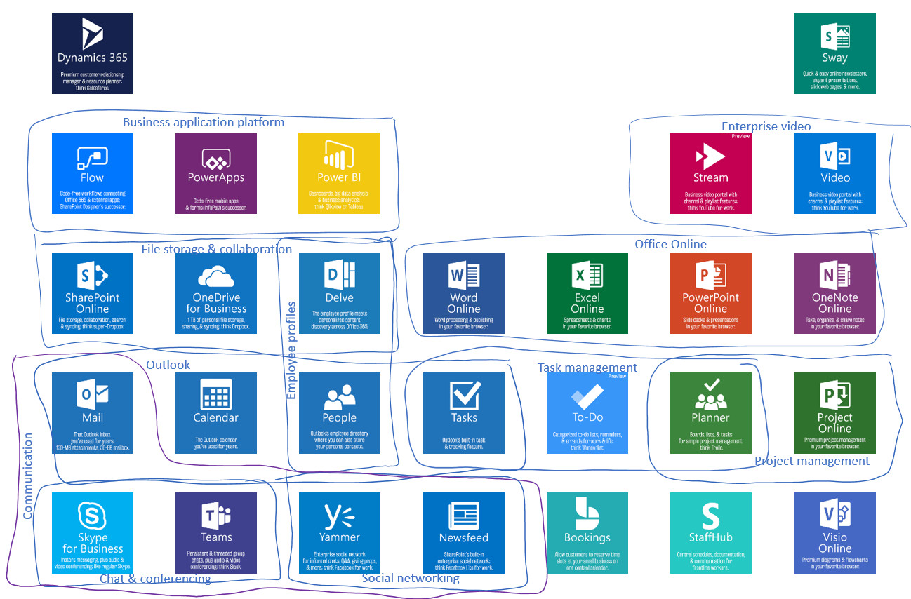
But nothing scratched my itch of also showing how these apps relate to each other. Every Office 365 admin hates getting the question “which app do I use when?” because the answer is always “it depends”. But if there was a way to simply show 1) all of the apps/services and 2) how they’re related with respect to functionality, you might go a long way with that.
So that was my goal.
Creative process
I made myself do what I tell every SharePoint site owner to do before they roll up their sleeves and play in the tool: get out a pencil and paper. I toyed with so many different ways to visualize this, you have no idea.
And I had limitations: other graphics out there are good inspiration, but my final product could not be mistaken for them. I take originality and creativity very seriously. Inspiration is one thing; ctrl C+V is another.
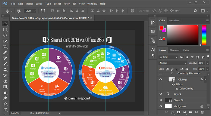
More than a year before publishing the first version, I was trying to provide comparisons between SharePoint and Office 365. I even had this close-to-done draft, but it just… wasn’t right. I couldn’t convince myself it was better than what was out there. And looking back now, it wasn’t… right. The comparison of “SharePoint 2013 vs. Office 365” is an apples-to-oranges comparison. And it’s clear I didn’t understand Office 365 fully at that point.
Presenting on the topic of “What is Office 365” is what really forces you to need to understand it more. Now I feel I have that knowledge and I (still) needed a visual aid that gets the message across, but also gets into a bit of the relationships between apps.
So, I started sketching. I tried to stay away from a circular design. That concept could be seen as already “taken” in the Office 365 arena. That proved to be difficult. I started from scratch, but it seemed the only way to connect things was with a curve. Eventually I got to a donut shape.
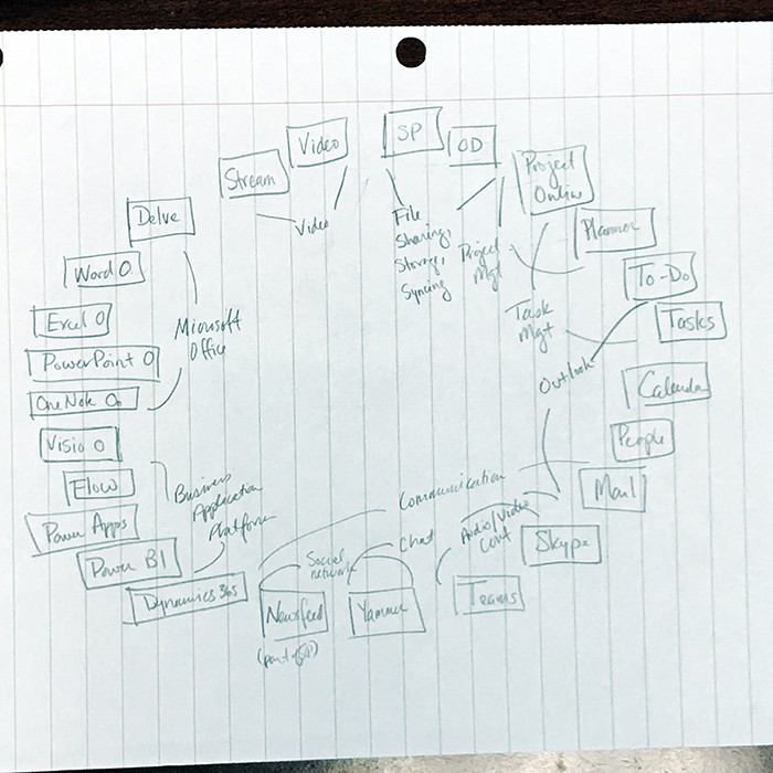
I told you it was pencil and paper.
But I didn’t like the layout. It was arbitrary. It was hard to make connections. And there was no good space to provide descriptions or any sort of categorizing text (e.g., extra-fee licenses). Plus, as more apps get added, the overall donut has to get larger, which means you see less in one glance than if everything’s closer together; you're essentially forced to zoom out.
I started thinking about how these apps are related. Some apps are quickly grouped within one category (Outlook's apps, for instance) but also another (task tools). So I started playing with groupings. That’s when it dawned on me that a two-axis system would get me the best bang for the buck, space-wise.
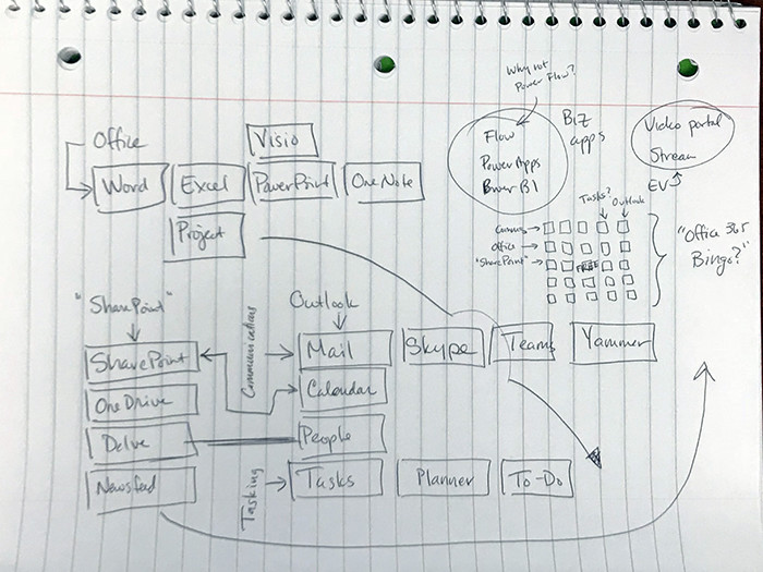
I toyed with a square layout (an ever-changing app listing kills this almost immediately), rectangular layouts (keeping the shape is difficult), a “Matrix”-themed layout (blame my linear algebra professor), and I even considered the idea of “Office 365 Bingo” (I had an opening in the center, which could be a “free” space). None of them seemed to work right.
I had another issue: lots of connections can be made, but only one app could be in one spot at a time. So now I had to prioritize connections. As an example, in the end, I don’t have SharePoint and Calendar linked, even though they both support calendaring. Or SharePoint and Power Apps (plus, later, Forms), even though they all have survey functionality to an extent. Come to think of it, I could have connected SharePoint to the tasks group, too. SharePoint, you crazy useful sometimes.
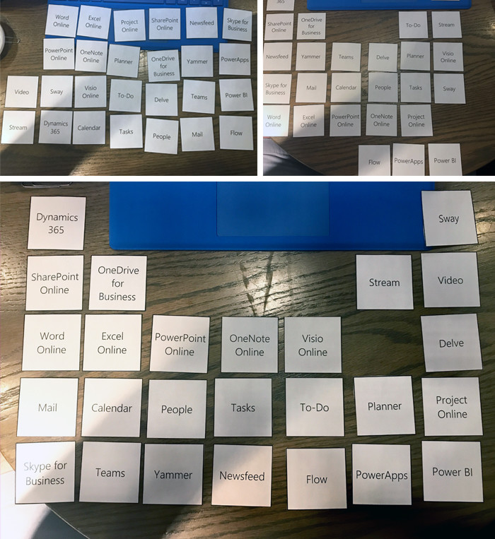
It became difficult to play with all the permutations of what this could be. Writing/drawing them out was cumbersome. So I made a printout with each app in a square and cut them out. I posted up at a local coffee shop for a couple hours one day after work and I played with arrangements. Whenever I liked one, I had to take a photo, lest I forget the layout.
I very much appreciate symmetry in design, but I started to realize that a symmetrical layout was impossible. In fact, if I tried for it on this go-around, the next time an app launches or dies, my house of cards of a design would fall.
But as I played, it became apparent there was a shape that could fit my needs: the general layout of the Periodic Table of Elements. The fact that H and He are alone in their top corners meant that outliers in Office 365 like Dynamics and, yes, Sway, could be outliers as well (I considered Visio, too, for the record). It also gave prime opportunity for adding new apps. Even new lines.
One downside was Office 365 apps aren’t periodic like nature’s elements. The connections I was making were arbitrary. I also wanted to stick with the brand colors Microsoft put forth. (This, ultimately, has been a confusing point of the final graphic: the colors mean nothing except to correctly represent the Microsoft branding, which I felt helped reinforce the apps’ individuality, when it exists). Another disadvantage was the fact that a layout like this isn’t all that different from how the apps are presented in the old waffle design (still in place at the time). And still another downside is any perception that I'm actually following some sort of Periodic Table rules; I'm not, but it's close enough to be apparent.
But, still, it seemed like a slick solution, one that’s relatable: everyone—whether they loved or hated chemistry—knows what the Periodic Table is. And the design amendable. It’s not overly novel. Like, at all. But I realized later that it didn’t have to be. Relatability >> novelty in this case.
Now, to digitize

I like to start all my infographics in PowerPoint. It’s generally good with everyday graphics and it’s a format that almost anyone can open. So if I need a review or help, it’s not a limiting filetype like one from Adobe. I began work. I did a standardized layout of what “a box” should look like. Size of the logo, font of the name, length of the description, box color, etc.
Then I played with the layout of the apps. After getting the final layout to a state of “good enough” (a term I still sometimes have to remind myself exists), I worked with an excellent graphic designer who has helped me on a lot of my graphics. She was able to take a pretty exact version of my vision and professionalize it to a level that, frankly, I don’t have.
Working with a graphic designer may seem like a cop-out. It’s not. If you want a good final product, you talk to an expert. I know the information, I know how I want it to be pictured, but I’m not a whiz with layout, colors, etc.
A graphic designer may not know the product, but s/he can work the vision into a presentation that you might otherwise not come up with. It’s the same reason you appreciate skilled tradespeople. They know their craft, they know it well, and they can out-do your DIY project any day.
Once we settled on a final graphic, I got to work in Photoshop to update a lot of things. For one, the descriptions in the first draft were far too small. So I had to shorten them. Brevity, it may be apparent, is not one of my gifts. That was hard for me. I also did some rearranging based on last-minute changes. Then I finalized it with some branding.
Launch
Then I launched it. I got feedback asking where Groups was. I had been working on a similar infographic in the background, but this lit a fire under me. So I responded. One of the more common critiques is, “Man, this is a really complicated graphic.” The error in this thought process is blaming the graphic as the bad guy. Office 365 is complex, so any explanation will be too. Sorry..?
Since then, we've made countless updates following Microsoft's progression, offered over a dozen translations, and made it an entire learning experience. Feedback has been great. I really appreciate the constructive critiques and I’ve tried to incorporate small changes whenever I update. I’ve had a lot of requests for the source file. Like, too many requests. I won’t be giving that out. Too much effort and too much risk that it's not used properly at this point.
I've gotten a lot of requests for re-use. First, thanks for asking before just taking. I’m totally cool with any internal use for users and adoption; I’m a big advocate of getting everyday users into these apps, so helping people that do what I do sounds great. That was my goal. We see it regularly embedded in organization's SharePoint intranets as a learning resource. You can learn about our re-use requirements here.
Conclusion
There’s a great meme out there that covers the intricacies of drawing owls. Apologies for the foul language, but this is the internet after all.
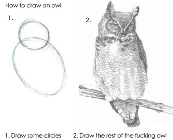
This is a meme for a reason: all too often people ask, “how did you do that?” only to get a response that’s way too high level and jumps from step 1 to step 100. You’ll get that at SharePoint conferences all the time. “Follow the best practices of change management and communication.” That’s my favorite. How you do that is the important part. And not many people actually cover that.
So with this post, you get an accurate idea of the recipe I used to create a visual aid that hopefully can help users across the world understand this product. And you now have an understanding of the process it took to get there.
It’s not overly creative. I took things I learned from presentations I’ve given, parsed how I break that presentation down, and thought about the visual aid I wish I had when doing that. I played for a number of hours with permutations of how I’d display it. I found a display pattern that could relate to almost anyone. I sketched it, designed it, then had it polished by a professional.
This is almost the visual aid that I want for that presentation. (Nothing’s perfect.)
And if you walk away with anything, it’s an understanding that you can create something similarly useful. Some of you will make something better. And that makes the community better.
So, get to it. Pull out that pencil and paper.


Obviously you have an opinion, so share it!